Visualizing Model Training to Improve Data Quality with Primer Data Map

Since the development of the Transformer model, finding and re-labeling mislabeled examples is becoming a much more important factor in model performance. Because Transformer models mean ML engineers are finding that they need less and less data to create a model that performs at production quality for their task, the impact of mislabeled data has a greater and greater impact on model quality.
As an example of how this plays out: for a simple classification task, a Transformer-based model like XLNet may only require a couple hundred examples in order to perform well. When your dataset only has 200 examples, and 10% of them are mislabeled, those mislabeled examples can have a big impact, dragging performance down and making it harder to improve the model even when more examples are added. As a result, nowadays it’s more important for model creators to focus on data quality than data quantity.
This is because Transformers can be “pre-trained” on natural language (such as random internet text) learning the rules of language simply by reading lots of documents. They can then be “fine-tuned” to perform a specific task, such as classification or named-entity recognition. Since we can start with a pre-trained model, which has already learned from millions of documents, fine-tuning for a more specific use case requires orders of magnitude less data. As an aside, speeding up model development is the rationale behind Primer’s pre-trained, domain specific models.
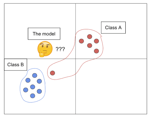
Let’s say you’re doing a classification between two classes, Class A and B. When your model sees an example that clearly looks like Class B, and instead it’s labeled Class A, it now has to adjust its idea of what Class A looks like to accommodate this weird Class-B-like example, which is likely an outlier relative to the other Class A data points. If this happens too many times, it can distort the model’s overall understanding of the task, causing it to underperform on both Class A and Class B.
Data Map simplifies identifying mislabeled data
Data Map is a Primer feature that makes it easy to visualize the outliers so that data scientists and labelers can quickly and easily spot and correct mislabeled examples.
Most data science teams are leveraging some form of external help with annotating examples, as businesses generally want to minimize the time data scientists or business subject matter experts spend time on data labeling. As a result, the annotators’ understanding of the task often differs from that of the SMEs, and examples can get labeled incorrectly as a result.
We built Data Map to empower data scientists to find these mislabeled examples in an automated way. On top of that, Data Map has the added benefit of giving us additional information about how the model perceived the examples in the dataset during training. (We’ll get into that during the technical explanation of Data Map.)
Our internal experiments using Data Map to find errors showed that, for small datasets, Data Map can identify up to 80% of the errors in the data by examining only 5% of the dataset.
More directly, instead of re-reviewing the entire labeled dataset, data scientists can simply look at the 5% “most likely mislabeled” examples and re-label those, and rest assured that the remainder of the dataset is likely correct.
How does Data Map work?
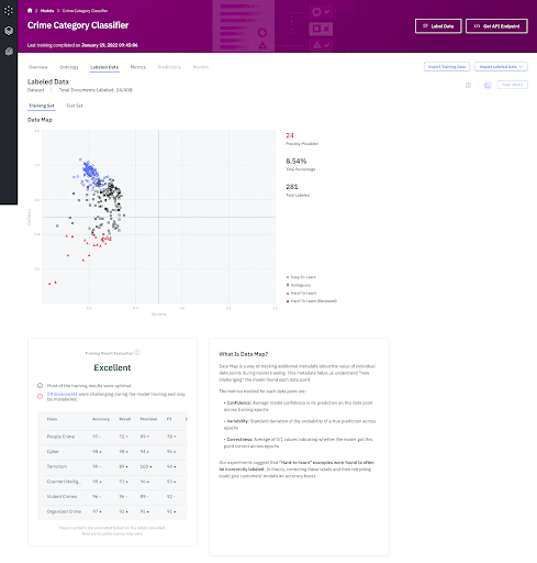
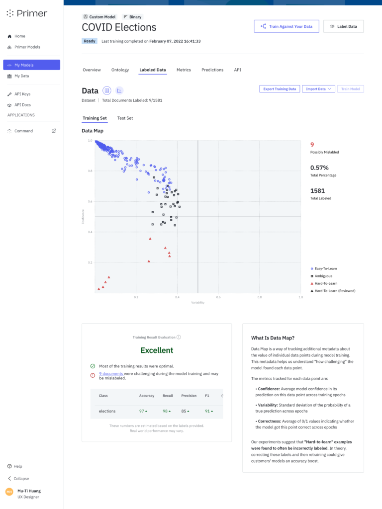
Data Map is based on the paper Dataset Cartography: Mapping and Diagnosing Datasets with Training Dynamics. The idea is to track three relevant metrics for each example as the model is being trained on those examples.
The metrics are:
- Correctness: How often the model got this example correct during training; or, more technically, the proportion of training epochs during which the model predicted the example correctly.
- Confidence: The model’s average level of confidence when making predictions for this example during training.
- Variability: How often the model changed its mind about the example’s predicted label during training. An example that oscillates between being classified as Class A and Class B repeatedly will have high variability; an example consistently classified as Class A will have low variability.
Each metric falls in the range [0, 1]. Usefully, these metrics also allow us to group data points into descriptive categories: easy-to-learn, ambiguous, and hard-to-learn.
An easy-to-learn example will typically have high correctness, high confidence, and low variability.
An ambiguous example will typically have high variability, because the model was indecisive about where to put it. There won’t necessarily be a trend with respect to correctness or confidence.
A hard-to-learn example will most importantly have low correctness. There won’t necessarily be a trend with respect to variability or confidence.
These three metrics, taken together, give us a better picture of how challenging the model found those examples over the course of the training.
The authors of the original paper found many interesting correlations with respect to the role that each group of data points plays in helping a model learn a task, which we would encourage you to check out if you’re interested. Here, we will focus on the hard-to-learn group.
Hard-to-learn examples are the examples we single out as being “possibly mislabeled.” The authors of the original paper found that hard-to-learn examples were frequently mislabeled, and our internal research has replicated this finding. Hard-to-learn examples which also have high confidence and low variability are particularly likely to be mislabeled (rather than just challenging), because it means the model was very confident about its answer, but still got the example consistently wrong.

Technical implementation
First, a research engineer on our Applied Research team had to implement the tracking of Data Map metrics into our internal deep learning library’s classifier training module. This required digging into the training loop for the model and inserting additional logic to store data about the relevant concepts after each epoch, then calculate them at the end of the training session.
Then, we had to spec out an ideal way to track and store the Data Map information our Postgres database. This required the creation of a dedicated “cartography” table, and updates to business logic throughout the application to introduce the concept of “possibly mislabeled” documents, as well as to keep track of whether or not users have “reviewed” their mislabeled documents. This was important because we didn’t want to constantly resurface the same documents to users if they had already addressed them.
Part of the data modeling work was to implement additional functionality into the deep learning module to track training examples by ID from beginning to end, so we could link them back to their original document IDs - something we hadn’t needed to worry about up to this point.
Next, our ML platform’s training service needed to make the requisite updates to pass the Data Map information through and save it to S3 whenever Automate sends it a new training job. We also needed to update the number of epochs we were using to give us more granular values from the data map calculations (Particularly for correctness - it wouldn’t be ideal if an example could only ever have .33, .66, or 1.0 correctness.).
Finally, our design and frontend team created an informative, user-friendly interface to communicate this information, and provide multiple entry points from Data Map to our document labeling experience. Customers can see Data Map results for individual documents while labeling, filter their list of labeled documents by whether they’re mislabeled, and can preview and jump directly to a mislabeled document by clicking on its data point in the graph.
Results
Data Map is a key utility for quality assurance of datasets in Primer, saving customers time by allowing them to review a subset of examples for errors rather than the entire dataset. Techniques like Data Map are particularly powerful because they help customers to get more performance out of existing data, rather than label new data and are an obvious example of Primer’s focus on data efficiency. We’re determined to make time-to-value short so customers can hit the ground running on their projects with a performant model.
For more information about Primer and to access product demos, contact Primer here.
Primer Enterprise
Informed, defensible analysis
Primer Enterprise is a secure AI platform that helps analysts and mission teams across the Intelligence Community, Defense, and Civilian agencies analyze massive volumes of unstructured data. It transforms fragmented reports, proprietary data, and open-source information into structured, traceable insight that supports faster, defensible decision-making.
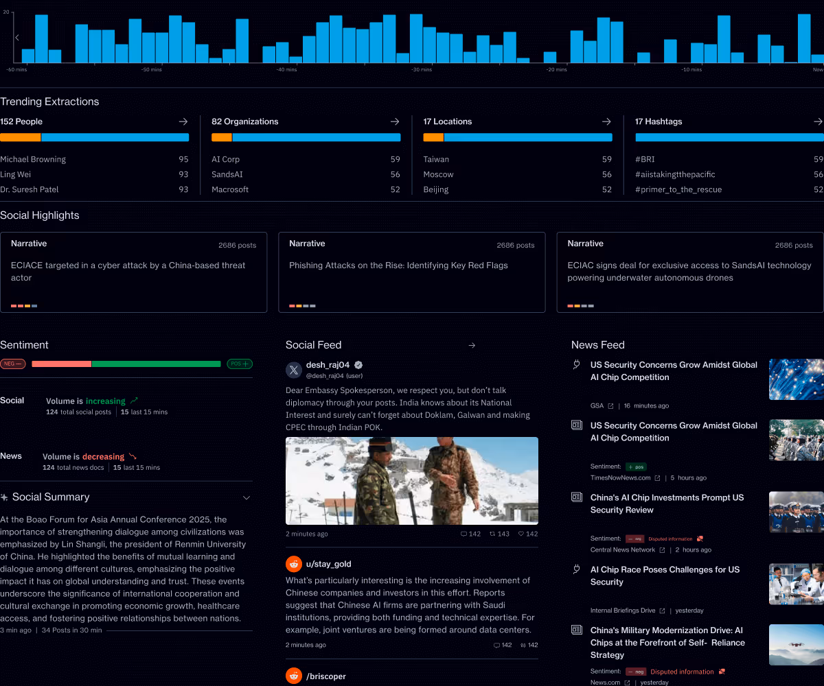
Primer Command
Real-time operational clarity
Primer Command is an AI-powered monitoring platform that helps mission teams keep track of narratives, track evolving topics, and detect emerging threats across global news and social media. It provides real-time visibility into the information environment so leaders can understand events as they unfold.